
Touchscreens have replaced many physical controls in modern vehicles, and that isn’t going to change anytime soon. While efforts to bring some sanity to touchscreen-heavy interfaces are underway, a new study shows that a button-enhanced interface is not necessarily better. The bad news is that car human-machine interfaces have become worse over the years, regardless of type.
Traditionally, cars have had buttons. A lot of them, to be precise, especially if it was a high-end model with many comfort and safety functions. There was no other way back then, as touchscreens and software interfaces did not exist. Everything changed when Tesla launched the Model S in 2012, and “glass cockpits” have become the norm in just a few years since then.
Some might say things have gone downhill from then, from the ergonomics and safety perspectives. Unsurprisingly, touchscreens and software menus have become more prevalent as tablets and smartphones have started dominating the world. Everyone thought a similar interface would gain traction in the automotive world as well. And they did, with screens growing in size and number with each model year.
Tesla’s approach: one screen, zero buttons
Tesla undoubtedly set the tone, but they also went to the extreme with touchscreen interfaces. While the Model S and Model X have kept a driver information display behind the steering wheel, newer models have ditched that. Everything was concentrated in the software interface on the center screen. And before too long, even critical controls started to disappear.
Wipers, horn, gearshift lever, and even turn signal levers were removed as Tesla iterated through model years and refreshes. Everything went to the center screen, or, in rare cases, a touch button on the steering wheel. The best part is no part, but where do you draw a line? At some point, people noticed that something was off and started voicing their criticism. Thankfully, Tesla listened to them instead of its cult members.
This doesn’t mean that Tesla changed its screen-centric interface. It just brought back some of the physical controls in one form or another. A turn-signal lever appeared, although devoid of light switches and extra functions. The horn is now again a large button in the center of the steering wheel, as it should be. The center touchscreen is still there, bigger than ever, but the clever interface makes interacting with it child’s play.
What is the auto industry doing?
Without an excellent software interface like Tesla’s, many carmakers have continued to integrate touchscreens into their vehicles. The experience has been poor in many cases, not necessarily because screens are bad, but because their UI designs were questionable.

Photo: Niklas Carle / Vi Bilägare
People have discovered that cars are not like phones, and finding a button on a screen while driving is more difficult than hitting the right physical button in older cars. Good luck if that button is hidden in poorly-designed, nested menus; you’d be better off pulling over. And if the infotainment system’s interface lags and stutters, it’s a nightmare. This explains why some have started to push back against touchscreens and want more physical buttons.
Carmakers like Volkswagen have started to blame the lack of buttons for their plummeting sales. Others, like Hyundai-Kia, have discovered that owners prefer to have a few buttons to set the climate or change radio stations, but touchscreens are also important. Finally, some, like Mercedes-Benz, have doubled down and even tripled down on touchscreens spanning A-pillar to A-pillar.
Test shows that Tesla’s touchscreen interface is better than many button-enhanced interfaces
There isn’t an optimal approach that the whole auto industry should follow. Tests have consistently shown that touchscreen interfaces can affect safety and experience, but they don’t tell the whole story. A new test from Vi Bilägare (literally “We, car owners”) in Sweden revealed that Tesla’s touch-heavy interface is better than many rivals that offer physical buttons.
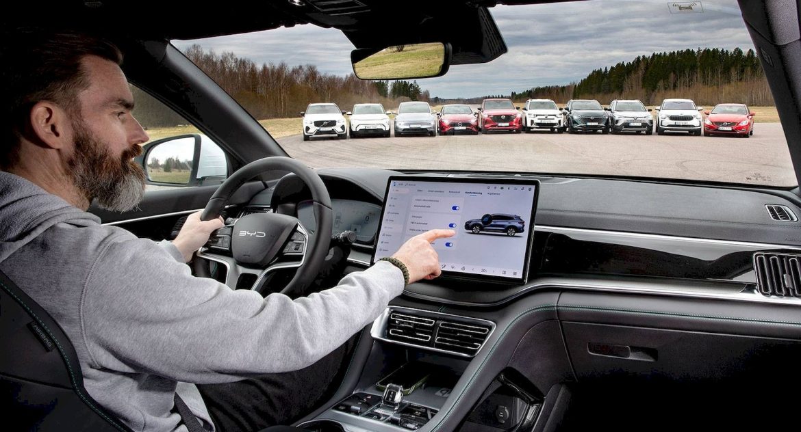
The tests included turning on the seat heating, raising the temperature by two degrees, and starting the defroster, turning on the radio and switching channels, resetting the trip meter, dimming the instrument lighting, and turning off the center display. The testers measured how long it took to complete the tasks while driving in a straight line at 110 kph (68 mph). They converted the results into distance traveled.
The Tesla Model Y in test performed significantly better than a Mazda CX-60. This has about 50 physical buttons, including a rotary controller. However, when testers conducted the usual tasks, the Mazda crossover traveled 1,137 meters before the tasks were completed. In the Model Y, the driver completed the tasks almost twice as fast, at only 608 meters traveled.

Photo: Niklas Carle / Vi Bilägare
This shows that buttons are not necessarily the holy grail of car interfaces. If they are poorly thought out, they can still be inferior to a good software interface. However, that doesn’t mean touchscreens are better. The best result was still demonstrated by a 2005 Volvo V70, with only 306 meters traveled while the tasks were performed.
The industry as a whole is moving in the wrong direction
The best part of the Vi Bilägare’s test is that it’s a re-run of a similar test it did in 2022. This allowed them to compare different car interface generations. The bad news is that car interfaces have gotten worse during those four years. The average traveled distance for the tested vehicles has increased from 756 meters in 2022 to 813 meters in 2026.
A good example of how things went is the Mercedes-Benz MBUX. When tested in 2022, the GLB interface required 20.2 seconds to complete the tasks. The new CLA, tested in 2026, needed 35 seconds to complete the same tasks. The testers noted that CLA’s screen took 19 seconds after unlocking the car before it responded to touch. No wonder some people hate touchscreens so much, especially if they haven’t tested a good software interface like Tesla’s.
While the test shows that you can build a good touchscreen interface and have bad button ergonomics, regulators have started to take issue with carmakers who eliminate buttons. Surprisingly, China is at the forefront of this trend with new requirements meant to eliminate driver distraction.
The regulation, which takes effect on July 1, 2027, demands physical buttons for safety-related functions like the hazard lights, defrosting and defogging systems, fog lights, high beams, windshield wipers, and washers. Drivers must be able to locate and operate these buttons by feel, without looking away from the road. The new regulation also specifies a minimum surface area for these buttons.
